
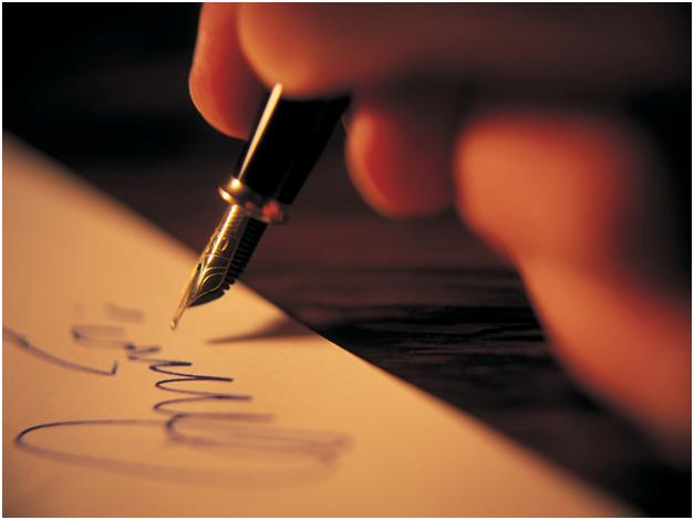
Personally, I cringe when I see people spend hours carefully polishing up their grant and then carelessly sign it without appreciation for what their signature reveals to the potential funder.
People new to grant writing will often telegraph that newness by applying a perfect, almost childish signature, a signature that looks like a second grade exercise in penmanship.
The trick to creating a signature which projects professionalism and self-confidence is to apply it quickly - as if you turn in hundreds of grant proposals every year. I can't cover all the details of how to create a perfect signature in this article, but I will highlight the most important things to remember.
First, I've listed the worst mistakes I've seen when it comes to attaching a signature to their documents:
1. Avoid crossing out your name. Sometimes people try to make their own name look more fancy or impressive by dragging their pen back and forth over their signature with a dramatic X. Since this is an unusual way to create a signature, I think it signals that the signer is too isolated, self-critical, and perhaps ungenerous with their time and money. I think it is simpler and friendlier to simply apply your signature without any flourishes which hit at unconscious self-destruction.
2. Avoid making your signature too small. To me, a tiny signature is annoying because it is harder to read. I think it also signals timidity, perfectionism, and a lack of energy. One of the tricks of creating a winning signature is opening it up a bit and realizing that it does not have to stay exactly above or between the lines. I like to see an energetic, slightly larger than normal signature, a signature which articulates the boldness needed to see a project through to completion.
3. Avoid making your signature too ornate. I've seen people create elaborate, ingenious, decorative signatures too. In my view, these signatures fail to communicate that you are a hard-charging executive director with tons of relevant experience. Sometimes, folks with elaborate details in their signatures - like hearts, symbols and odd shapes - end up producing products that look more like graffiti than a normal business signature. In the context of non-profit leadership, however, these ornate details suggest a quirkiness, difficulty, and social isolation which make the funder wonder whether or not it would be a good idea to partner with your charity.
This is particularly true when the signature betrays anti-social influences or hints at gang affiliation.
This is particularly true when the signature betrays anti-social influences or hints at gang affiliation.
On the positive side, the signatures I like the best are composed of simple lines, often featuring only the signer's initials and not every letter in their name. I also like to see the signature end on an upward note. This communicates a feeling of optimism and positive conviction that the project will be completed on time and budget.
As a general rule, the signature should always be done in blue ink to show that it is original. The use of other colors will only distract from the professional image that will win you the most grant money.
No comments:
Post a Comment